Health, Wealth or Freedom?

AN IMPORTANT & BADLY DESIGNED SURVEY

There’s a massive survey being done in three countries that’s trying to act as a bellwether for people’s views on Coronavirus priorities.  I genuinely hope it isn’t influencing any decisions but I know in my heart of hearts that it is.

It’s asking a simple, obvious question, “What matters more: trying to save every life or protecting the economy?”  And every country where the question is being asked has, unsurprisingly said it cares more about saving lives than it does about money. 

DON’T ASK A QUESTION & GIVE FALSE CHOICES

The good thing about the survey result is that people are lovely.  The bad thing is everything about the question that led to the result, which commits the basic and deceptive logical fallacy of offering a false choice.  Here’s just 3 things wrong with this choice:

1. It’s asking us to distinguish between 2 things that aren’t independent; in fact they’re highly dependent on each other.  A stronger economy saves lives with studies of wealth versus longevity showing how important the economy is for saving lives and for years of life.  And conversely, because at its foundational level the economy is just people doing valuable things for each other, losing lives is by definition a loss to the economy

2. The choices aren’t presented in a like for like way: one is extreme, emotive and individual; the other is measured rational and impersonal.  In fact it’s presented in the most non like-for-like way I can think of, other than “would you rather (1) save this kitten from drowning or (2) see an extra 0.1% annual return on the median tax free savings account?”

3. The survey designers have presented just these 2 factors and ignored all the other factors that affect the broader underlying question of how cautiously we should open up after lock down.  There are many, many overlapping factors here that might contribute to more or less caution.  One obvious missing factor to understand, to my mind, in an enforced but popularly supported lock down, is freedom.

IS FREEDOM MORE IMPORTANT THAN HEALTH? EVIDENCE FROM KEY WORKERS

Though I’m not aware of anyone asking directly about the importance of freedom in any recent surveys, digging into the data from a couple of them does give us some hints about how freedom stacks up in importance against health and “the economy.”

If, to avoid philosophical rabbit holes, we just say that freedom is the ability to get out and about and away from home confinement, one group that has this honour is the newly defined key workers whose behaviour is being compared to other workers in an ongoing ONS survey.  

Key workers are having to work harder while the rest of us are working less, and they’re much more concerned about their health than the rest of us.

If we’re to believe that health and safety dominates people’s concerns then this should be reflected in lower life satisfaction.  But key workers are more satisfied, feel more worthwhile, are happier and are less anxious than the rest of the working population.

Evidence like this can give us no more than hints, but it looks at least like the freer group is happier despite much greater health and safety concerns.  

Maybe it’s not just their greater freedom though.  Maybe there’s something else at play here because key workers report greater job and financial security, and maybe the key worker demographic is the sort that would be happier with life anyway.

IS FREEDOM MORE IMPORTANT THAN HEALTH & WEALTH? EVIDENCE FROM REBELLIOUS YOUNG MEN

To address this potential bias, we’ll look at a different group from another survey, but one that enjoyed freedom because it broke the rules.

A King’s College/Ipsos Mori survey used data clustering on survey sample to identify 3 groups in the UK lock down: an Accepting group, which was fine with the lock down and was older and predominantly male; a Suffering group, which did not like but put up with the lock down and was predominantly female; and a Resisting group, which actively revolted against the lock down, and was predictably predominantly young males.  To make comparison as like for like as possible, I’m just going to compare the birds who weren’t content to be caged: the Suffering and the Resisting.

The Suffering group are compliant and even supportive of lock down, the Resisting are a bit rebellious and have gone out and about, breaking the rules.

Our freedom loving Resisting group has more health worries and financial worries than the Resisting group.  So they’re similar to the key workers in being worried about their health, but they’re also worried about their financial futures.

But despite being less accepting of the lock down, more certain that they’ve had Coronavirus, and more precarious financially, the freedom seeking rule breaking Resisting group is less anxious and less helpless than the more disciplined Suffering group that is complying with the lock down.

So a legitimately freer group, key workers, is happier despite having much greater health concerns than the rest of us; and an illegitimately freer group, The Resisting, is happier despite thinking it’s got more health and financial concerns.  This is all hinting at freedom being an important ignored issue.

HINTS ONLY, BUT WE CAN BE CONFIDENT IT’S ABOUT MUCH MORE THAN HEALTH & WEALTH

Our analysis is far from solid.  We’ve relied on studies that use personal assessments as opposed to solid measures of actual behaviour.  The second study uses a statistically dubious technique called data clustering that commits a basic statistical sin called sampling on the dependent variable.  And we’ve ignored every other measure that isn’t to do with health, finance and freedom, so we’re guilty of the same lack of exhaustiveness that I criticised in the first chart in this article.

But I think the data shows enough for us to suspect that health and finance may not be the only important issues when making decisions about releasing our self administered restrictions, even if the question were asked properly and the choices not a false dichotomy.  And maybe freedom should be weighing a bit more heavily.

by Steve Hacking & Jim Powell

SOURCES:

YouGov survey of attitudes to Coronavirus in Britain, USA and Germany

https://yougov.co.uk/topics/health/articles-reports/2020/05/20/attitudes-coronavirus-crisis-britain-germany-and-a

ONS survey on Coronavirus behaviours & attitudes of key workers and other groups:

Opinions and Lifestyle Survey (COVID-19 module), 24 April to 3 May 2020 

King’s College and Ipsos-Mori data clustering analysis of the Accepting, the Suffering and the Resisting

https://www.kcl.ac.uk/policy-institute/assets/Coronavirus-in-the-UK-cluster-analysis.pdf

Posted in Uncategorized | Leave a comment

Losing Perspective About Big Events

Apparently the world will never be the same again.  Experts and average Joes keep telling us so.  And only a handful of iconoclasts (or sociopaths depending on where you stand) are countering this narrative by saying death count from the current pandemic is no worse than the flu and reminding us that previous pandemics such as swine flu and SARS were barely a blip.  Both groups are warning against an economic shock.  One because that’s what happens when you have pandemics no matter how you try to manage it, the other because we’re shooting ourselves in both feet with our social and economic policies.

Each side is doubling down on its argument using data on deaths and GDP, and speculation about the future of “social distancing.”  I want to put these tragic and economically worrying numbers in perspective and see which side, if any, looks right.

Is it Really No Worse Than the Flu?

Let’s start with mortality and see if the no-worse-than-the-flu crowd have got it right.  We’ll only be able to get to the bottom of the death counting issue once fuller figures come out for total and excess deaths, which will take at least a few more weeks and be adjusted for the rest of the year.  Of course each side is claiming the death count is wrong: iconoclasts are saying COVID-19 deaths are over counted (the “dying with vs dying of” question that infuriates experts for some reason); experts are saying they’re under counted because COVID-19 isn’t always recognised.  But here are the official numbers for the UK to mid April, some more recent unofficial ones and a trending total.

Looking at the raw numbers for the year so far COVID-19 looks no worse than the flu plus pneumonia.  But 4 factors make it in many ways quantitatively and qualitatively worse:

  • It’s additional.  It’s not replacing this year’s flu.  Looking at excess deaths it’s in addition to this year’s flu, so it roughly doubles the flu and pneumonia death count
  • It’s new.  We’re not used to it in the same way that we’re used to tens of thousands of souls dying every year from flu and pneumonia
  • It’s recent.  It’s all happening very quickly, with most of those 20,000 plus deaths happening in a couple of weeks as the current peak hits and passes
  • It’s unknown.  We don’t know how many people it could hit, whether and how much it will re-emerge as we loosen movement controls, or how to prevent or mitigate it with drugs, antibodies and vaccines

So the no-worse-than-the-flu crowd look like they’re under-estimating it, unless you recognise that the flu and pneumonia take tens of thousands of lives every single year, which we seem to accept as a reality of life with no lockdowns.

Is it Worse than Other Pandemics?

How about the iconoclasts’ other argument that we were told swine flu and SARS would be terrible and they were barely a blip.  Well they do seem to be far off the mark here: looking at total deaths, COVID-19 is an order of magnitude bigger than any recent pandemic.  

Even though swine flu was worse in one way in that it hit younger children much harder, overall COVID-19 is a much bigger deal.

So is it Bad, as in World Changing Bad?

We’ve concentrated our fire on the no worse than the flu crowd and concluded that they’re underplaying it.  Let’s turn our attention now to the commentators advising that the world will never be the same again to see if they’ve got a point.

To do this, let’s compare our current crisis to the biggest historical precedent for which we’ve got decent data, the Spanish Flu, and see if economies dived and the world changed momentously after that.

Of course, we haven’t seen the end of COVID-19 yet, and there may be second and third waves, but look at the numbers of fatalities (I’ve had to make the axis 10x bigger than my previous chart to cover Spanish Flu).  

Spanish Flu was an order of magnitude bigger than COVID-19.  It also killed the young disproportionately versus COVID-19, which seems to hit the elderly, those with pre-existing conditions, and those who experience it in heavy doses.

Don’t forget that the population of these countries has doubled to tripled since 1918.  When adjusting for population, the greater deadliness of Spanish Flu is even starker.

Do Pandemics Always Hammer GDP?

It’s difficult to isolate data to see how this massively larger pandemic affected world economies because European economies were rebuilding after a world war in which 20m people were killed and 21m wounded.  Communism and the Russian revolution were transforming the east of Europe, and the country worst hit by the Spanish Flu, India, had economic numbers that were hard to rely on.  The least polluted data set to assess seems to be the US, which lost relatively small numbers in the war, was less affected by communism, but still lost hundreds of thousands to the Spanish Flu.

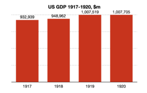
Here’s what happened to US GDP from the start to past the end of the 1918-19 Spanish Flu pandemic.

That’s right, it kind of just kept growing through the pandemic, and flattened after.

Arguments that this ultimately led to the great depression are a bit specious.  The Spanish flu ended in the US in 1919.  The Dow did have a brief downturn in 1920-21 a year after SF ended, and economists don’t even mention Spanish Flu in explaining its causes.  The great depression didn’t even start until 1929.

So do pandemics inevitably cause depressions?  History says they don’t.

Do Pandemics Change Society?

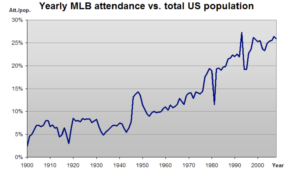
Changes to the world aren’t only about economics.  Let’s have a look at how the Spanish Flu affected something that many speculate will never be the same again: attendance at large events.  Here’s what has happened to US baseball attendances since 1900.   

After the Spanish Flu, in the 1920s, attendances went up sharply in a golden age of baseball featuring the iconic Babe Ruth, and they’ve been going up ever since with the exception of economic downturns and wars.

So will the world never be the same again? Sure, in some ways; but it seems it will only change in the dramatic ways people are speculating if we deliberately and determinedly make it so, with some generous and maybe some self serving intentions.  We had a much bigger and deadlier pandemic in 1918-19 and the world got back to action pretty finely.

Will we inevitably have a massive downturn? Sure we might, but there’s lots of things that correlate much more strongly with downturns, with more and better data behind them, such as the asset bubbles we’ve been creating since the start of the century, or the economic and trade restrictions we’re now seeing played out around the world.  To lay the blame for a depression entirely on COVID-19, when there was only a slowdown after a much bigger pandemic and a world war, seems like one of those tricks politicians play when they want a go-to excuse for the less rosy results of their other policies.

Things look big when they’re in front of our noses, especially if they’re new and we’re not used to seeing them.  When that thing seems bad, it probably is bad.  When it seems world changing, we need to stop and check because we don’t have a whole lot of everyday experience of world changing.  So if we do check against something that was much bigger, and if that didn’t change the world that much, well this probably doesn’t need to either.

By Steve Hacking

Posted in Uncategorized | Leave a comment

Fear of Exponentials

In an environment of general anxiety, concern about the future, and morbid fascination with charts that show relentlessly rising illness and death, I want to give a view about what we can and can’t take out of the early stages of something that’s largely unknown.

EARLY STAGE DATA IS DECEPTIVE

In our own small way, we’re very used to seeing early stage data.  In these new and usually high growth situations it’s easy to be fooled by the presentation of the data and the early trends.

One example in the current pandemic is the FT’s tracker of total cases and deaths, that shows an exponential  growth line, and case numbers going into the tens and hundreds of thousands.  Those are log10 scales so they’re going up in steps of orders of magnitude. 

This is unmaliciously deceptive, which I’ll illustrate with a few issues that we often see in our world.

1. Some Sources are Unreliable and Many are Inconsistent

The different countries in the chart identify cases with very different levels of rigour and measure them in different ways.  So intra country comparisons can at best focus on broad numbers and trends looking at big differences and changes only.

And some countries are less reliable than others.  The FT posted on 22 March an implicit criticism of the US regime comparing its totals to China and Iran.  The US policy may or may not be poor, but I think it’s a safe general rule of thumb to not quote numbers from autocratic regimes as evidence.

2. Cumulative Numbers Show Accelerated and Relentless Growth

If I wanted to create as much alarm as possible from a set of numbers, I’d plot them cumulatively with exponential trend lines like the FT and many others have done.

Take a look at these charts of (1) total cases and (2) new cases and compare how the UK, Italy and S Korea look in the 2 charts.  If you’re like me, you’re a lot less scared by the second chart where the numbers aren’t accumulated from all the previous days, you can see changes a lot more easily, and down is down not up.

We need to measure what’s useful and what gives us insight.  I can understand measuring total active cases to plan ICU capacity and scenarios against it.  I can understand measuring new cases because we can see what is and isn’t working and whether we’re on an upward or downward trend.  I can understand measuring total deaths for context of how critical this all is (more of this later).  

But measuring total cases seems like morbid fascination.  It’s maybe even psychologically and practically negative as, even when we do things that have an actual effect, the totals by definition just keep going up.

3. Confusing Measurement with Reality

With isolated exceptions, such as cruise ships, the charts we see in the press don’t measure total cases; they measure identified cases.  This has a scary effect on growth rates because countries are typically getting better at testing and counting.  Early case numbers are very likely understated, and as countries get better at identifying things this accelerates apparent growth.

The flip side of this is that later growth numbers are accurate but the slowdown of growth (and the apparent effectiveness of mitigation measures) will be exaggerated too.  So the real growth curve of what’s actually happening will be a lot less curvy than the measured one.

4. The Nature of Lifecycles

Lifecycles of novel things often look exponential early.  This is partly because of the measurement we’ve already covered, partly because people with higher propensity succumb sooner, and largely because of the nature of growth from a low base (going from 1 to 2 to 4 in a new space is a lot easier than 32 to 64 to 128 as the space starts getting filled).

How long they stay exponential and the aggressiveness of that exponential is a matter of environment, of action and of time; slowing is inevitable, and decline much more common than not.  Let’s have a look at the progression of Italy and South Korea to see this.

For Italy in the left hand chart, I’ve shown the best fit line using data just from the first week, then the first two weeks, first three weeks, and finally the first four weeks, which ended on March 22nd.  As you can see, the trend gets continually less aggressive.  The type of best fit also changes in week 4 from those scary exponentials to a less frightening polynomial.  Looking just at the data, Italy is still trending up but is near or at the brow of the hill.

It’s also worth noticing that Italy’s lock down started in some places but not all on day 9 with an expectation of two weeks for effects.  While it has likely been effective, the rate of case growth was already slowing by then.

South Korea, which started exponential, a few days ago was a declining (wide n-shaped top of the hill) logarithmic, but is now a more slowly declining exponential flattening of the other side.  You should also notice the axes, where South Korea’s case load is one tenth Italy’s with a fairly similar population but younger demographic.

These stages in the lifecycle illustrate why earlier action to suppress the fast growth exponential makes more difference than later action once you’re up the exponential and into later stages.  The South Korea line looks very similar to the Italy one in its early stages before South Korea starting acting heavily.  But they also show that exponential growth lasts a limited time before it slows, even for late actors.

5. Numbers are Hard to Understand Without Context

The worst hit country whose numbers we can believe is Italy, where more than 6,000 people’s families have been hit with tragedy as I write this, and where the numbers could easily, easily quadruple.

Here’s some other tragic numbers from Italy to put the COVID-19 deaths in context.

For UK folk, our COVID numbers are less mature but our recent lockdown reflects our government’s desire to learn from Italy and hopefully suffer less.  For the UK, I’ve added in a bar of 20,000 deaths, which in the early stages our Chief Medical Officer said would be a good result.

This pandemic is awful, and we’re quite rightly highly sensitised to it because of ICU capacity and lives cut short.  But erring on the side of overstatement also has its costs, such as families anxiously over buying because they think they may run out of food, which deprives the very vulnerable people who are most likely to be hit hard by the virus and who need to stay as healthy and condition free as possible.

EARLY STAGE MODELS ARE WRONG

As someone whose scientific qualification and very first job was modelling extreme events with 20, 50 and 100 year likelihoods, I’d venture from personal experience that all the early theoretical models will be wrong.

We do still need to model scenarios in early stages, based on conceptual frameworks and best guesses of parameters that use the best historical data we have.  We can’t just wait because we need to plan.

However, modelling complex systems from first principles is a fool’s errand, and the more extreme the event and the more totally wrong will be your first model.  So we need to square the circle by calibrating against what’s actually happening, changing the parameters or the entire model, and reforecasting.  Then we need to recalibrate the next day with the next set of data and keep doing that until we can predict with some workable confidence intervals.  In many western countries, we look like we’re still more than a week away from those workable confidence intervals.  Of course we need a pessimistic case as well as a central one but our cases need to be continually informed and updated.

So if anyone is criticising Imperial College’s early, frightening estimates of the outturn, then they’re being unduly harsh.  If they’re still using them to predict the outturn, then they’re being foolish.  

SO WHAT?

Most of us aren’t advising our government on pandemic management strategy, so what’s on our minds is our satisfaction and degree of compliance with the rules now being imposed on us, how we can plan for our families and livelihoods with an unknown territory in front of us, and how much we should be worried as we see upward moving plots of cases and deaths and pictures of overflowing ICUs.

We’re still in the exponential stage in the UK and US, so each effort we make now to suppress growth counts a lot, much more than the effort we make in a week’s time, and we will be able to relax sooner.  The 23 March tightening of the UK lock down seems like bitter medicine to many of us, but will have more effect now than later. 

And we should look at the published plots of cumulative exponential case and death growth with a careful and less gullible eye, stop equating higher earlier stage growth automatically to bad management, and keep updating our perception and expectations as the data rapidly emerges.

It’s bad, but it’s far from the end of days, and we’d all be better off replacing the alarmism that comes from believing the early stage models and trends with an updated and better informed view as those trends mature.  And when the pubs reopen, I’ll be doing my bit to get the hospitality sector back on its feet.

by Steve Hacking

Posted in Uncategorized | Leave a comment

Do Polarised Views Get More Attention? A Twitter Experiment.

Here’s a bit of modern received wisdom: in a loud world with all kinds of competing, shouting voices you need to be bold and polarised to get any attention.  Lots of people say this as if it’s a fact.  But is it correct and based on anything, or is it just rubbish?  We couldn’t find any actual evidence either way so we decided to test the proclamation ourselves on that most polarising of public forums, Twitter.

THE EXPERIMENT

We set up 3 accounts on Twitter, all of which engaged on the subject of energy and environment.  One account was strongly pro-green and renewables, one strongly anti-renewables and strongly pro nuclear, the third nuanced and looking to highlight the merits and drawbacks of different stances.  All had similarly mundane profiles with no links.  All followed the same 8 people initially.  And all followed the same rules: tweet every morning, midday and afternoon of every weekday in October 2019; participate in existing conversations, do not initiate; follow everyone who follows you; carry on conversations as far as counterparts stay engaged; do not block or mute; and stay in character even if it hurts.

To make analysis fair, we compared all the engagement metrics on a per impression basis, i.e., we divided engagement metrics by the number of times our characters’ tweets appeared in other people’s timelines (likes per impression, replies per impression, etc.).

We put the experiment details at the back of this article but we haven’t revealed the accounts in case we want to do a follow up.

DO POLARISED VIEWS GET MORE ATTENTION?

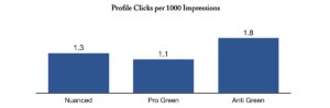
The weakest measure of interest about someone in Twitter is when someone clicks on their profile.  On this measure, our polarised anti green character gets the most interest, but the nuanced guy gets more than the other polarised character, so the jury’s out on the theory so far.  Nothing much to see here.

Profile Clicks per 1000 Impressions (Nuanced vs Polarised Tweets)

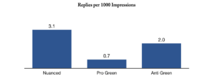
But profile clicks are easy and might just be logging how intriguing this character is.  A stronger engagement is when someone takes time and interest to reply:

Replies per 1000 Impressions (Nuanced vs Polarised Tweets)

Nuanced guy comes out top, by a long way: a nuanced position got much more engagement than either polarised position.  If we were to show number of exchanges per conversation, you would see that much of this is because he gets more replies to tweets and he gets more multiple exchanges per reply.  

So, counter to the received wisdom, nuance gets more engagement.  But engagement doesn’t equal approval, and as the saying goes, if you stand in the middle of the road you get hit by traffic from both directions.

DO POLARISED VIEWS GET MORE APPROVAL?

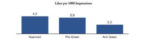
The easiest way on Twitter to show approval is to hit the Like button.  Here’s what happened:

Likes per 1000 Impressions (Nuanced vs Polarised Tweets)

Mr Nuance wins again.  This is a one-sided measure because Twitter doesn’t have a dislike button, but our hypothesis coming into this was that polarised views would get both more approval and disapproval from the different sides, and that nuance would just generate a bunch of meh.  This data says the opposite and nuance gets more gross approval.

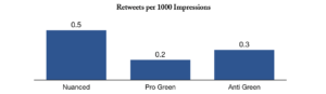
Likes are easy though.  A more committed way to show approval on Twitter is to retweet to your own followers.  Guess what happened here?

Retweets per 1000 Impressions (Nuanced vs Polarised Tweets)

In fact the only measure where Mr Nuance didn’t get the best approval rating was in followers per impression.  He actually did get the most total followers but also had the most impressions and so lost out to Mr Polarised Anti Green on followers per impression.

NUANCED = ENGAGEMENT BUT  EASY

Nuance seems to get more engagement and more gross approval but that’s far from the whole story.  Looking deeper into the replies to tweets, most are to challenge or disagree.  So the greater interest Mr Nuance got was mainly people bothering to disagree with his pontifications.  All of our characters got some form of abuse, but Mr Nuance was the only one to be blocked and the only one accused of being a fake trolling account, despite being the one seeking to be balanced. People.

Nuance was also harder work.  With no dogma to fall back on, being nuanced meant thinking about each subject on its own merits and looking for multiple angles and insights.  His tweets were typically longer, commonly needing editing and word shortening to stay inside the 280 character limit.

WHICH OF POLARISED AND NUANCED IS MORE REWARDING?

It depends what you’re after: if you only care about engagement then go for nuance, if you care about your sanity then don’t do either all the time.  Within a week of our one month experiment we disliked all of our characters, whether nuanced or polarised, and were mighty relieved when the experiment was done.  In a way this illustrated how “taking a nuanced position” vs “taking a polarised position” is a flawed generalisation.  Staying nuanced when the situation deserves a strong agreement or an up yours is painful and artificial, as is staying dogmatic when the other person makes a valid and reasonable counterpoint. Being all nuanced felt pompous and weak; all polarised felt stubborn and stupid.  Both felt false and didn’t reflect the natural dance of assertion and acknowledgement from a grown up conversation.

EXPERIMENT LIMITATIONS WHEN YOUR SAMPLE IS 3

Of course this experiment has its limitations.  Though our characters tweeted a total of 680 times during the month, there were still only 3 of them, and the conversations they happened to find themselves in certainly added randomness.  A decent sample would be 30 of each.

Nevertheless, when the received wisdom is that polarised positions are a prerequisite for engagement, the burden of proof is on those who spout that wisdom.  Our small experiment challenges that, even if it doesn’t disprove it with 95% confidence; it even suggests that the opposite may be true. 

A NEW HYPOTHESIS – FOR BETTER ENGAGEMENT, BE NUANCED

So our new hypothesis is that if you want attention, you’re better off being nuanced.  And if nuance gets better engagement on Twitter, we’d hypothesise that it would get better engagement anywhere.

APPENDIX – STUDY DATA

CHARACTER BIOGRAPHIES

Nuanced: “Life is for living making the most of it. Enjoy reading history and cycling.”

Green: “Taking each day as it comes. I enjoy swimming and cooking.”

Anti Green: “Trying to live the good life. Happy go lucky. Enjoy a good book and long walks.”

GROSS DATA

     Nuanced     Green     Anti Green
Tweets     301     201     178
Impressions     68059     38858     26439
Retweets     33     10     6
Replies     211     78     18
Likes     285     84     103
Profile Clicks     89     70     28
Followers (ex 2 starters)*     8     3     7

* Characters followed each other at the start of the experiment and these were excluded from the follower count

SAMPLE TWEETS

NUANCED

My position on climate change is that we need to take action because, given uncertainty, the stakes are too high not to take action (photo of previous tweet attached). But I’m going to continue to challenge and I’m not going to take anyone’s side

Did you mean climate change? Do you mean that AGW is the dominant factor in change or just that it exists?

I think I’m hearing you accept that the burden of proof is on you as the positive claimant and that you need to show evidence to defend your claim(s) against skeptics.

Any scientist or statistician projecting forward by 80 years to the nearest half percent needs to reconsider their vocation.

You’re equivocating people who challenge a hypothesis about climate change with people who reject the historical mass murder of millions. You know that’s pretty bad don’t you?

GREEN

That’s ridiculous and so pointless too. We have to act now to prevent every city choking us to death

I agree. Simply teaching children facts and science isn’t alarmist it’s the opposite. The fact we need their help isn’t a bad thing. Children are the future after all.

Well said. Lets get this planet back to being green like it should be with mass forestation

This is the new we want – the Green movement is now mainstream. Govnt will HAVE to listen now

Good work. The oil industry is determined it seems to destroy the planet for all of us,

ANTI RENEWABLES & PRO NUCLEAR

Talk about responding to alarmism. They’ll be left so far behind economically.

That’s exactly what the green movement is doing with its misanthropic views, which permeate the heart of environmentalism.

The Greens never get that facts right. Fact.

That’s ridiculous. What a waste of time and energy literally. I think we should invest more in nuclear energy to be honest.

What a load of tosh. Just simple regression analysis as usual.

Isn’t it fascinating that the Green Movements don’t have a clue about the science?

Until we instigate a proper nuclear energy programme, oil is all we got.

Most models are wrong and alarmist including those that predict energy.

This article was written by Steve Hacking and Jim Powell

Posted in Uncategorized | Leave a comment

A Golden Rule for Experiments – Only Bother with Big Effects

Experimenting Good; Copying Amazon & Google Bad

Running constant experiments is an excellent way to navigate through a complex uncertain world.  It helps keep things fresh, helps you be daring and grow, and can take out a whole heap of risk.

But if you follow the media hype and copy Amazon, Google or Netflix’s relentless testing of every tiny aspect of their proposition then you’ll waste a whole lot of time and potentially a lot of money.  If you follow the equally hyped British Cycling’s marginal gains philosophy, you’ll be making the same mistake.

I’ll (partly) explain why here.

We need to start by asking what makes a good experiment, which I think has 2 components:

  1. There’s a good cost benefit of doing the experiment at all
  2. The experiment is done well for your circumstances. 

I’ll just cover the first of these, and leave the second for another day.

Cost Benefit of Doing the Experiment

Here’s what I think makes a good cost benefit in doing an experiment:

  1. There’s a potentially big enough effect
  2. It’s cheap, for you
  3. You don’t bet the farm, i.e. there’s a small enough downside if it doesn’t work
  4. It gives you information quickly, good or bad

2-4 are hopefully self evident so I just want to dwell on the need for a big enough effect.  We’ve described before (here) why you should be using experiments to make bold moves and swing for the bleachers.  But there’s even more reason to just experiment with big effects.  Have a look at this chart:

This chart was from a study[1] of attempts to replicate experiments in the social sciences.  It shows the effect size[2] in original experiments versus the effect size in attempts to replicate the experiments.  The first thing to notice is that most of the points are below the 1:1 line, i.e., the effect size in the attempts to replicate is usually lower than in original experiments.  The second thing to notice is that the stronger the effect size, the more likely the experiment is to replicate at all.  And replication is what we care about in real life

How Some People Benefit from the Numbers Game & You Don’t

Here’s where a numbers game helps the big, highly hyped experimenters:

  • If you can afford to do thousands of experiments then some of those dubious-looking low effect ones will be legitimate and replicate in real life, and you’ll be ahead despite many wasted non replications
  • The benefit to Amazon of tinkering with the landing page and getting a tiny percentage increase in conversion or basket size is enormous.  So even if the effect only turns out to be 1/10 or 1/100 the size in real life, it’s still enormous.  The benefit of a 0.1% increase in speed for the much heralded marginal gains crew at British Cycling and Team Sky is massive in a sport where a tyre’s width wins or loses you a medal, i.e. it’s not a marginal gain at all

Most of us aren’t big enough to benefit materially from the occasional sub 1% improvement.  Even fewer of us can run enough experiments on marginal gains to benefit from the odd few lucky replications.  So we should do our cost benefit before we even start to gulp down the experimenting Kool Aid, and only bother with big exciting changes with potentially big effects.


[1] https://osf.io/preprints/bitss/zamry/

[2] Effect size is a term that can mean many things [https://en.wikipedia.org/wiki/Effect_size] in statistics.  I think of it as how big an effect you observed, versus randomness or the effects of other factors that you haven’t been observing

Posted in Uncategorized | Leave a comment

Swinging for the bleachers – the case for experimenting.

How would you play baseball differently if the cost of swinging and missing was tiny, i.e. 100 strikes and you’re out, not 3?  My guess is you’d change style and swing more aggressively, more often, because the odds of you striking out have changed dramatically in your favour.  The downside odds change, and you change your game.

A Traditional and Wrong Headed Way to Look at New Initiatives

Here’s how we commonly think about the risk and return of new initiatives.

As we try things that are further from business as usual, our expected pay off goes down because it becomes increasingly unlikely that the initiative will come off.  Worse, and much much more importantly, the variability of the outcome and the associated downside get scarily bigger and bigger – and if we play that dangerous game and lose, we die.  This is how we become conservative tinkerers, searching for sure things and low risk piecemeal improvements.

This way of thinking is, of course, completely wrong.

A Smart Way of Thinking About New Initiatives

Instead of thinking of trying new things as a one step game, where we go all in and lose a third of a life if it doesn’t come off, we need to think multi-step.  In a multi-step approach we might research the case for doing something, learn, then experiment in a tiny way, learn, experiment in a bigger way, then roll out all guns blazing.  If at any stage it looks unattractive, we pull without losing very much; if it looks good, we open the taps.

As long as the cost and delay of experimenting is small, we can afford several dozen misses and we’ll still be OK.  This completely changes our our expected return, and the ambition of the projects we pursue, because variability has morphed from our enemy into our friend.  The more we stretch ourselves, as long as we test and adjust, the better is our return.  Fortune now really does favour the brave.

Yes, we know that business experiments aren’t a new thing.  Lots of businesses experiment, and that’s fine; but they’re mainly doing it by tinkering with business as usual where the variance and payoffs are small.  The same business that obsessively and relentlessly A/B tests the positions of buttons on user interfaces has never trialled a whole new staff compensation structure or tested even one or two changes to its core pricing model.  Unless you’re running thousands of experiments a year, like Netflix and Amazon, you’re much better off experimenting at the aggressive end.

We still need our business as usual because we need to survive until next year, and benefit from the results of our beautiful experiments.  But our growth comes from stretching ourselves and trying out new things.  If we don’t, we’ll be well beaten by people who are smart enough to swing for the bleachers when the glory should be ours for the taking.

Posted in Uncategorized | Leave a comment

The need to avoid binary thinking in presenting

Behavioural Economics (BE) dominates the strategic thinking in many agencies today. Hardly surprising, as BE focuses on human behaviour being non-rational / emotional. Much of modern advertising focuses solely on eliciting emotional responses via brand advertising over product features and benefits.

Perhaps BE, over recent years, has done a too good a job at reminding those of us who are interested in human behaviour that people aren’t completely rationally actors? Although the suggestion that previous to BE thinkers claimed people were solely rational actors, is really a straw man, set up by followers of BE, very few theories on human behaviour have seen people as purely rational beings.

Has BE surpassed its usefulness to remind us that we are both emotional as well as rational decision makers? Has it tilted the scales so much that now we have a situation where we are staring at binary thinking? I.e. we are emotional beings that can’t be rational but in fact only post-rationalise our decision-making to fit our emotional thinking. As Daniel Kahneman might say System 2 simply rationalises the decision made by System 1. There is no way to disprove whether someone is post rationalising or not.

BE is the most common way that scientism can be seen at work in agencies today.

Scientism subscribes to two main issues, that science can explain everything (including human consciousness and behaviour) and secondly the appearance of science where there is none.

The scientific method of forming a hypotheses and testing it over and over to attempt to disprove it is what scientism lacks. Scientism is the daddy of confirmation bias, where a belief searches for evidence to support it, not to disprove it. That’s not science.

A scientific theory must show a method where by it can be disproved. It is replicable.

BE calls on psychological experiments that often struggles to be replicable, in fact many of the effects / biases that BE describes have a replication crisis. And yet some agencies and marketers depend on them as if they were scientific.

Because science is held in such high esteem, some agencies attempt to appear scientific in their presentation of insights in pitches, despite the lack of the scientific method used to derive those insights. This is a problem because they may well end up selling advertising that has little chance of working in the real world.

It’s ancient thinking to know that it isn’t one or the other, emotional or rational – but both. Style and substance. Or as Aristotle would have it logos and pathos.

The problem is that the heuristic thinking that people use to make quick decisions are idiosyncratic. However, on some occasions we think decisions through better than others.  Often depending on the size of decision itself.  And sometimes our heuristics are quite good and other times they fail us.

If agencies really believe that people are largely emotional decision makers then they will end up making work that is style over content, ring any bells, and fails to understand the plethora of problems a brand faces to grow.  Advertising will focus solely on being emotive with zero rational content so brand owners may well forgo product development, subscribing to the belief that people are not ever attracted by features or benefits. If agency teams don’t consider features and benefits at all when writing briefs but solely focus on people buying emotionally, then why should brands develop their products? Which is what brands have actually done successfully to help them grow historically.

If agencies want to be able to appeal to all departments within a brand and compete with the rise of management consultancies they would be more successful  in pitches if they made that case that people are both emotional and rational decision makers.

Finally, who really wants to be advised by someone who doesn’t believe at all in rational thinking?

Posted in Uncategorized | Leave a comment

Me See – MECE – Do you?

What is MECE (pronounced, me see)? And how does it help consultants solve problems? And how could it help agencies win more pitches?

MECE stands for Mutually Exclusive and Collectively Exhaustive.

It is a method that is a key teaching in our new ‘Structured Thinking’ training course.  It is very popular (probably compulsory) in large Strategic Consultants –  that ad agencies and marketing agencies will come up against in pitches more and more in the years to come.

Structured Thinking helps a team within an agency look at the bigger issues a brand faces, not simply its advertising and marketing. And importantly look for evidence for the changes they recommend to a brand’s advertising and marketing  by providing the evidence backed insights that have used in solving a brief .

The advantage of this is that it ties the advertising solution in with the bigger issues that a brand faces, which is exactly what management consultants do. And why they compete so well with agencies.

In short MECE checks that once a problem is broken down into its component parts there is a) no over lap – mutually exclusive (ME) and b)  nothing has been missed – collectively exhaustive (CE).

A good example of MECE in the world of advertising is the way Byron Sharp (How Brands Grow) breaks down what a brand needs to do to grow. Here is only the first level of a logic tree, asking the question –  What does a brand need to do to grow?


There is no overlap here – they’re mutually exclusive and they are collectively exhaustive, what else is there?

Now you’d take it to the next level and start breaking down each component. The logic tree can get very deep, however this way you’ll only need to boil the sea once.  At each level we make sure they obey MECE.

Then we ask in what ways can we increase physical availability? Still obeying MECE – be available in more outlets that are bricks and mortar and or more availability on-line?

Then the next level, where on-line? What retail outlets?

Increasing mental availability (traditionally advertising’s, marketing’s and branding’s bread and butter)  needs to break down into its components obeying MECE – develop distinctive brand assets, develop below the line promotions, develop promotions above the line.

Note each level of MECE can be and / or statements. E.g. Increase just one component, two components or all of them. This is where the research comes in for each component, when we form a hypothesis. E,g We might want to test how distinctive our brand assets are – so asking the question do they needs to be changed at all? If we are to change them, how and provide the evidence for those changes. No guess-work – evidence.

An agency brief would be asking what does what does their specific brand need to do to grow.  However, you might even start with a different question altogether, like, what changes could we make to (insert brand name) advertising? Or it could be a relative question –  Why is the market leader’s advertising better than ours? Or what are the key reason’s people choose one brand over another? Whatever the question you decide upon,  MECE is one tool that will help you stay on track.

Eventually, as we break down a problem logically further and further say 5-6 levels deep (where it gets harder and harder to maintain MECE, especially CE) we’ll hit upon a thought, possible solution, that we can share with the agency team, which will form a hypothesis, that will need to be tested and so we will need to look for evidence. This evidence will either prove or disprove our hypothesis.

It is the CE part of MECE which leads to better creative solutions because as we move down the tree it becomes harder and harder to be collective exhaustive and so we become creative in our answers and it becomes more of a fun brain storm around a very tight component of the question we initially asked. This is where your insights / thoughts could be unique to how other agencies competing on a brief will see the problem and yours will be evidence based.

The advantage of working this way is that your biases can be torture tested, we all have a best guess at an answer to a question but there will often be biases present. So instead we can test our thinking and  provide some evidence to our prospects / clients. They can then follow our logic in our pitch and see that our thinking is not just thorough and crystal clear but hard to contest.

Posted in Uncategorized | Tagged , | Leave a comment

THE GIANT RETURNS ON GETTING A BIT BETTER

 A guest blog from Steve Hacking CEO at Kardelen

THE GIANT RETURNS ON GETTING A BIT BETTER

Bad Ideas Designed To Stop People Thriving: #1, The Learning Curve

Think about developing a skill, and you think of a learning curve. Early on you improve quickly, then progress gets slower; and it’s soon hard to tell if you’re improving at all. At some stage you plateau and stop improving, just like your handwriting, driving and party dancing did a few decades ago. If you’re super conscientious you practice for 10,000 hours, making tiny improvements to get really good, but this seems to have a high price.  Here’s how that learning curve looks

Chart 1 - Learning Curve w Title

If we think like this, it’s no wonder that we eventually stop making an effort to get better and unconsciously start coasting, then maybe even start looking around for a new skill.

The good news is that this limiting picture of learning curves is, in the vernacular, “a crock of shit”:

  1. Learning curves for individuals don’t need to look like this – there’s nothing inevitable about plateauing
  2. The vertical axis measures the wrong thing, and fools us into thinking the wrong way

I’ll just look at this second issue here, and propose a better measure that will make you think differently and cheer you up.

What if we looked At reward instead of ability?

Let’s analyse the data lover’s paradise of baseball, and the abilities of folk who are all the way along baseball’s learning curve – starting pitchers for major league teams.

Here’s the pitching ability of the top 55 ranked pitchers using one common measure: walks and hits per innings pitched, or WHIP.  Lower is better.

Chart 2 - Pitching Ability w Title

I’ve only shown one season, so variability is higher than for career stats.  But if you look at the trend line, you can see the difference in ability between pitcher number 55, Wei-Yen Chen, and pitcher number 1, Clayton Kershaw.  It’s tiny: less than 1 hit or walk conceded in every 10 innings pitched.  To go up 1 place in these rankings, you need to improve your ability by about 0.2%.

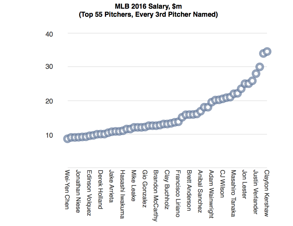
Let’s look again at our pitchers, but instead of comparing ability, we’ll compare how much they get paid.

Chart 3 - MLB Salary w Title

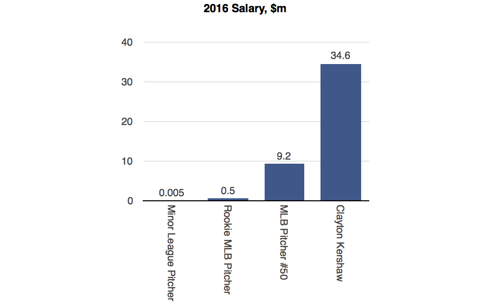
Don’t forget that these guys are on the far right diminishing returns part of the learning curve.  The difference in their abilities is tiny, but the reward for tiny improvement is huge. In fact the further along the learning curve you go, the more difference a tiny improvement makes.  Here’s a comparison of salaries that includes people from the full professional spectrum of pitching ability.

Chart 4 - All Baseball Salary w Title

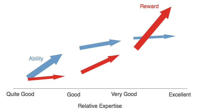
Choose any field that rewards ability – from sales and project management to writing novels and betting on football matches – and you’ll find the same pattern.  Change your reward from money to whatever is important to you: glory, gold medals, cats rescued or souls saved from damnation, and again the pattern is the same.  The better you get, the bigger your reward for getting even better.  Looking only at increase in ability leads us to draw the wrong conclusions because it’s the rewards that really matter.  When we look at rewards, we end up seeing our learning curve in a new way:

Chart 5 - Reward Curve

What to Practise?

Moving from left to right on this chart is about smart, conscious practice. That leads us to 2 questions: what to practise and how to practise?

My takeaway from this article is about what to practise: take the few fundamental skills needed to be good at your job and practise those a lot, no matter how good you already are and no matter how little you think you can improve. That seems to be the best way to reap some giant returns on getting a bit better.

Posted in Uncategorized | Leave a comment

YOU THINK A CAUSED B, BUT HOW CAN YOU TELL?

(This is a guest blog from Steve Hacking CEO at Kardelen Training)

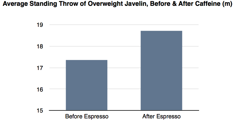
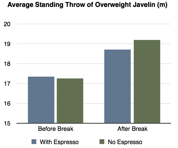
Here’s an obvious improvement, and a clear cause of that improvement.

The stimulus of the espresso really caused an improvement in the javelin throw. More evidence for the performance enhancing benefits of caffeine? Not so fast.

What Caused What?

If we see one thing happen (A) and another thing happen (B) we can conclude at least 5 different things:

1. A caused B. My singing (A) caused my singing teacher to wince (B).

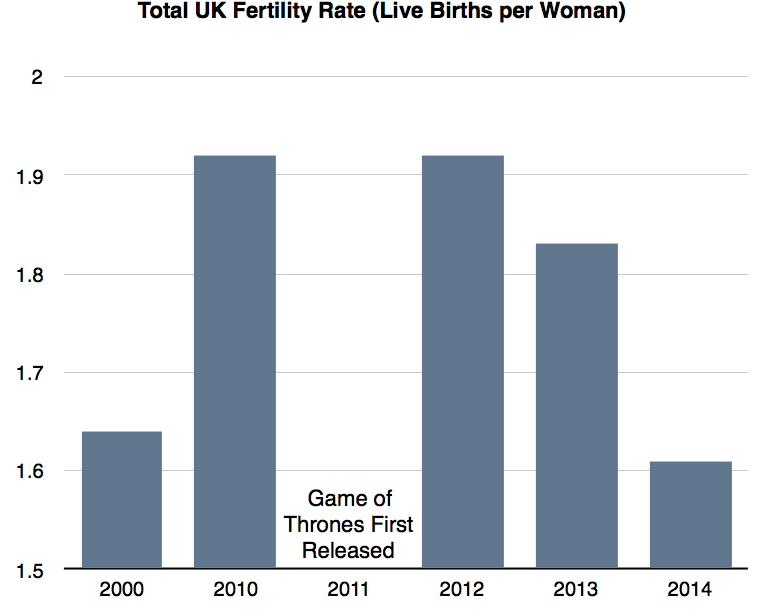
2. Something else caused B. Here’s an analysis of UK fertility rates (B) before and after Games of Thrones (A) was released on HBO in 2011. Anyone arguing that GoT caused a decrease in birth rates, Khaleesi?

3. Something else caused both A and B. If shark attacks (B) go up at the same time as ice cream sales (A) on US and Australian beaches do we conclude that those ice cream sellers are tempting in the sharks, or maybe that hot days cause more people to go the beach and in the sea?

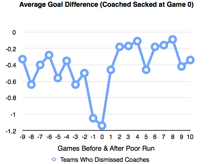
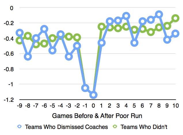
4. The change in B was random. Here’s one time we can feel sorry for football managers. Take a look at this excellent German research on football teams’ results (B) when they had a bad run of form and changed manager (A). Looks like changing the manager was a good idea.

Now have a look at the teams that had similar dips in form but didn’t change manager. Do you still think changing the manager made a difference? Or that teams just revert to their typical performances following a bit of bad luck?

5. B caused A. Did our change in manager (A) cause a change in performance (B), or did a run of bad performances (B) cause a change in manager (B)? Does veganism (A) cause better health (B) or are health conscious people (B) more likely to become vegan (A)?

How to Tell if You Have Your a Cause

In most, complicated, real life circumstances the way to know you have your cause is to find yourself 2 almost identical situations: in 1 the cause being present; in the other absent.
We can see if these 2 situations already happened in the real world, just like our German football teams that did change manager after a bad run compared to those that didn’t.
We can also create these 2 situations by doing our own trial, to see what happens in when our speculated cause is present versus when it’s absent. Here again is my experiment of throwing the javelin, this time showing before and after a break that didn’t involve drinking espresso.

Looks like the espresso isn’t the cause of the improvement after all. Maybe it’s just that a good warm up and practice causes better performance.

Even if you think you have a cause, here’s a few other tests that’ll raise your confidence that you really do:

  • Can the effect be obviously explained by anything else? Are ulcers obviously caused by stress, or could it be something else, say, H Pylori?
  • Does the effect happen every time the cause is applied? Does hiring Pep Guardiola cause your football team to tiki-taka its way to the Championship? Yes, well except when it doesn’t.
  • Is there a low chance of the cause effect being explained by randomness? Run lots of
    experiments on small enough samples and you’ll find lots of fascinating counter-intuitive cause effect relationships that no one will ever replicate.
  • Are our sample groups similar? If we only give training to super stars on the promotion fast track,we can’t compare its effect against a sample of regular folk who aren’t on the fast track.
  • Is there a chance that the participant is wittingly or unwittingly fixing the outcome? Would you trust the findings of a sports drink company about the big race time improvements that come from drinking its product?

We will all sometimes jump to conclude that our management intervention caused our temporarily underperforming branch to improve, that people are successful because they say “no” more often and not the other way around, or that our team lost because we weren’t wearing our lucky jumper.  If it’s important, that’s the time it’s worth reflecting on whether we really do know what’s a cause and what, well, isn’t. If we don’t, we’ll be drinking too much espresso and not doing enough javelin practice.

Posted in Uncategorized | Leave a comment